Color theory is the theory of how colors go together. We are primarily concerning ourselves with subtractive color theory rather than additive color theory, though more on additive color theory may be found here.
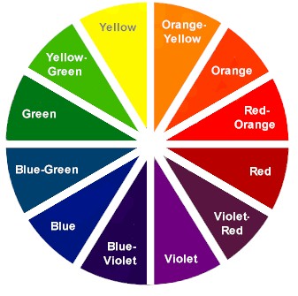
A Hue refers to the color name.
Primary hues are commonly accepted as red, yellow and blue. These hues cannot be produced by combining other colors, but are the basis for making all other colors. On the color wheel, the primary colors form a major triangle.
Secondary hues are formed by combining two primary hues. The three secondary hues are orange, green and violet.
Tertiary or intermediate hues are formed when a primary and neighboring secondary hues are combined. These include yellow-green, blue-green, blue-violet, red-violet, red-orange and yellow-orange. The Primary, Secondary and Tertiary hues are the basic twelve colors, but numerous color variations can be produced from them.
Value is the lightness or darkness of a hue, ranging from white to black on the value scale. Add white to a hue and it becomes a tint; add black and it becomes a shade. For example, red can vary from pink to dark red on the value scale.
Chroma is the brightness or dullness of the color of the reflected light bouncing off of an object. We refer to the strength or weakness of a color, depending on the saturation of the light. Full saturation refers to the pure hue. When a pure hue is mixed with another color, it becomes grayed.
Color Harmonies
Monochromatic harmony is developed around one color. This could mean variations in value or intensity of one hue, such as light, medium and dark blue. Monochromatic color schemes are easy and restful, but can become monotonous.
Analogous harmony refers to neighboring colors on the color wheel. An example is yellow, yellow-green and green. This produces a restful effect and is less dramatic than the complementary color scheme.
Complementary harmonies are colors that are directly opposite of each other on the color wheel. They tend to be dramatic, such as the red and green Christmas color scheme. Complementary colors intensify each other and tend to be bold.
Warm and Cool Colors
Psychologists divide hues by those associated with warmth and coolness. Warm hues include the yellows, oranges and reds. These hues accelerate the pulse, increase body temperature, and indicate an extroverted emotional response. Cool hues include the blues and violets, and are perceived as receding, tranquil, and passive. Dark values of any hue are considered warmer, while light colors are considered cooler. If the hue is intense and warm, the color is considered warm. Likewise, cool, intense hues are considered cool.
Warm, or advancing, colors appear closer than they actually are. These colors include the bright warm hues of red, orange and yellow. The more intense a color, the more advancing it seems. Cool, or receding, colors make objects appear farther away than they actually are. These include blues and violets.
Light, Texture and Color
The type of light under which a color is seen has a direct effect on its perception. When the source of light changes, the color also changes. Natural daylight from a northern exposure is the best light in which to view color and its effect on a person. Artificial incandescent light projects yellow and red onto color. Fluorescent lights tend to cast blue to green tones on color.
Generally speaking, rough textures tend to absorb light, making colors appear deep and dull, while shiny surfaces tend to make colors appear clear and bright.
Colors are also influenced by other colors. When two colors are placed side by side, differences appear greater. Those differences will vary directly according to how much the colors differ in hue, value and chroma.